Overview
Optimizing a landing page for desktop and mobile helps maintain a consistent user experience, improves readability, and supports faster page loading. FlexiFunnels lets you configure device-specific styling so that each page element can display appropriately across screen sizes.
Use this guide when building or updating landing pages that include headings, text, images, buttons, forms, timers, or image-heavy sections.
Before You Begin
- Open the required landing page in the FlexiFunnels page editor.
- Identify the elements that need device-specific adjustments.
- Prepare optimized image files before uploading them to the page.
- Preview the page on both desktop and mobile before publishing.
Video Tutorial
Step 1: Switch to Mobile View
In the FlexiFunnels page editor, switch to Mobile View before making mobile-specific changes. This lets you adjust the selected element for mobile without changing its desktop configuration.
Step 2: Configure Mobile-Specific Style Settings
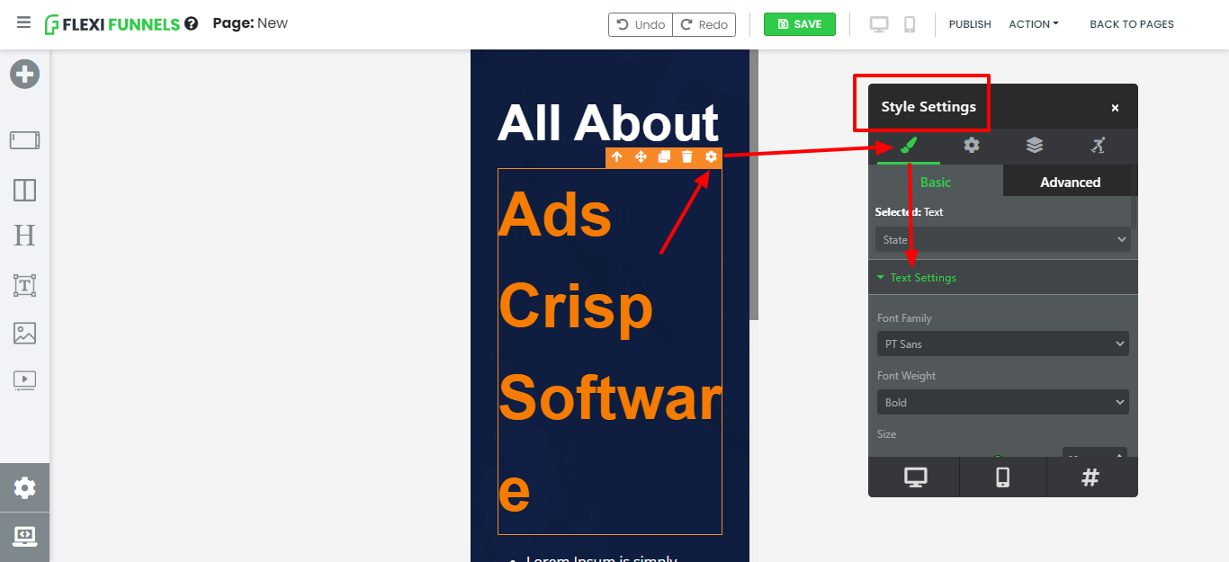
Select the element you want to optimize, such as a headline, image, text block, or button. Open the settings using Gear Icon → Pencil Icon → Text Settings, then adjust the mobile-specific size, spacing, or other styling values.
For example, you can set a headline to 45px in Mobile View while keeping it at 56px on desktop. Repeat this process for other page elements as required.
Step 3: Use Inline Bar and Style Settings Appropriately
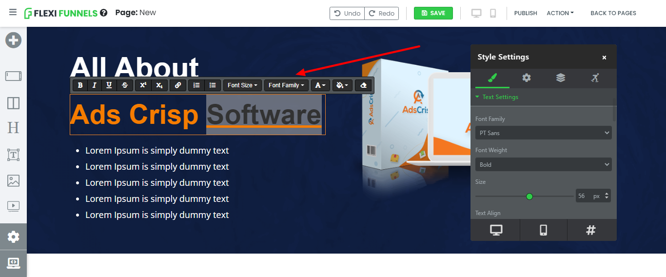
Use the Inline Bar for formatting a specific word or phrase within a text element. For example, use it to underline one word in a sentence.
Use Style Settings for element-level formatting, such as font size, text color, alignment, margin, and padding. Using each option for its intended purpose helps keep page formatting consistent and easier to manage.
Step 4: Adjust Margin and Padding
Use margin and padding to create a clear, mobile-friendly layout.
- Margin: Adds space outside an element.
- Padding: Adds space inside an element, between its content and border.
To inspect spacing, hover over an element while another element is selected. Green space represents padding, while the shadow area represents margin. Adjust these values in Style Settings while in Mobile View.
Important: Avoid excessive spacing and advanced settings. Overuse can disrupt the layout across devices and make troubleshooting more difficult.
Step 5: Apply Recommended Typography Sizes
Use consistent typography to improve readability and maintain visual hierarchy across desktop and mobile devices.
| Element | Recommended Desktop Size | Recommended Mobile Size |
|---|---|---|
| Headline | 48px–72px | 30px–36px |
| Subheadline | 28px–48px | 23px–26px |
| Paragraph | 18px–28px | 18px–20px |
| Timer | Use the page design requirement | 23px |
Step 6: Optimize Images
Optimize images before adding them to the landing page to reduce load time and improve the visitor experience.
- Use collages: Combine related images into a single image where appropriate to reduce the number of DOM elements.
- Convert images to WebP: Use WebP to reduce file size while maintaining image quality. WebP Converter Tool
- Compress images: Reduce image size without unnecessary quality loss by using TinyPNG.
Step 7: Maintain a Clean Page Structure
- Avoid <br> tags: Use separate paragraph elements instead of repeated line-break tags.
- Manage colors centrally: Use Style Settings for consistent color schemes instead of applying multiple inline colors.
- Reduce nesting: Avoid adding rows inside rows or sections inside sections.
- Limit child elements: Keep rows and columns focused. For image-heavy or testimonial sections, use two or three smaller rows instead of one complex section.
Verify the Configuration
Preview the landing page in both desktop and mobile views. Confirm that all text is readable, spacing is consistent, images remain within the viewport, buttons are accessible, and the page loads without unnecessary layout shifts.
Common Scenarios
- Mobile headline adjustment: Reduce a desktop headline size so it remains readable without wrapping excessively on mobile.
- Image-heavy landing page: Convert and compress images to reduce page-load time.
- Testimonial section: Split a complex testimonial layout into smaller rows for improved performance.
- CTA formatting: Use inline formatting for a single emphasized word while keeping overall button and text styling in Style Settings.
Best Practices
- Configure desktop and mobile styles separately where required.
- Use Style Settings for element-level formatting.
- Use the Inline Bar only for targeted text formatting.
- Apply consistent typography sizes throughout the page.
- Use margin and padding intentionally and avoid excessive values.
- Convert and compress images before uploading them.
- Avoid unnecessary nested rows, sections, and child elements.
- Test the published page on desktop and mobile devices.
Before Contacting Support
- Confirm that the correct page and element are selected.
- Check the element in both Desktop View and Mobile View.
- Review margin, padding, font size, and image width settings.
- Verify that images are optimized and compressed.
- Remove unnecessary nested rows or sections.
- Save and publish the latest version before testing the live page.
Expected Outcome
After completing these optimizations, your FlexiFunnels landing page remains readable, visually consistent, and responsive on both desktop and mobile devices. Optimized images and a clean page structure also support improved page-load performance.
Was this article helpful?
That’s Great!
Thank you for your feedback
Sorry! We couldn't be helpful
Thank you for your feedback
Feedback sent
We appreciate your effort and will try to fix the article